Some things just aren't done. You wouldn't see Apple changing its logo, or renaming the iPhone, or jumping from iOS 18 to iOS 26. But it seems not everything is sacred to the company – not even the Finder icon.
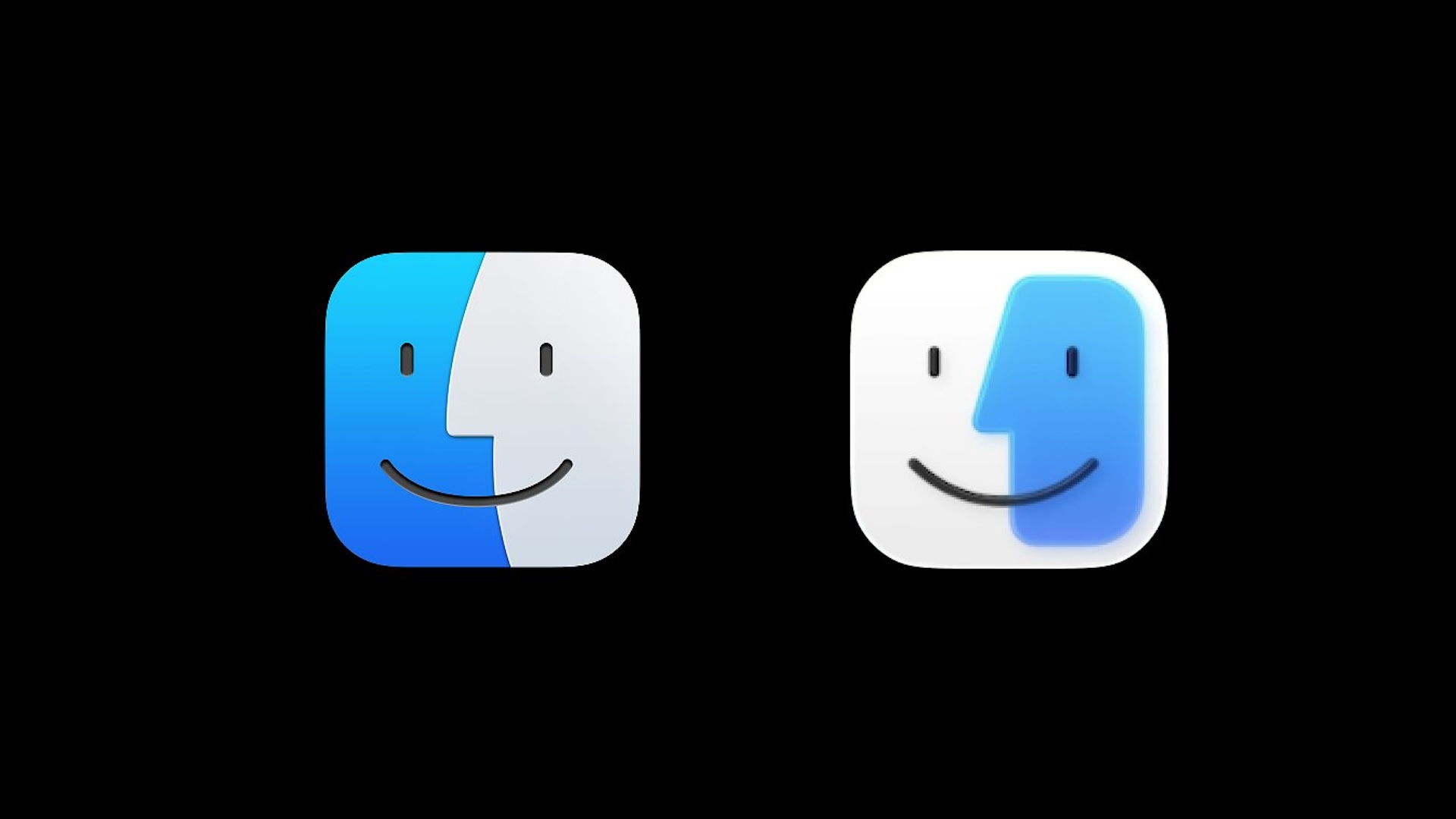
As developers get to grips with the beta version of macOS Tahoe, they've spotted that Apple has done something inexplicable. Not only has it applied the new Liquid Glass texture to the Finder icon, but it's also swapped around the iconic blue and white colours, breaking decades of icon design history.
Old (left) vs new (right) (Image credit: Apple/Future)
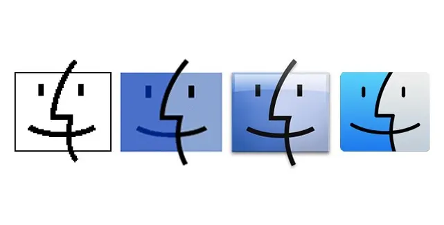
Ever since 1996, the smiling Finder icon has featured a blue left side, and a light blue, then later grey, right side. As per Wikipedia, the 'Happy Mac' "draws inspiration from the design of the Compact Macintosh series and from the Batman character Two-Face. The logo also shares some similarities to the faces of the 1934 painting Deux personnages (Two Characters) by Pablo Picasso and to the Bauhaus emblem."
The Finder icon has been around for decades (Image credit: Apple/Engadget)
Apple's reasons for changing the icon aren't clear, but the reaction from users is, with countless social media posts calling for the update to be reversed, as well as suggestions for alternate design routes Apple could have taken.
Wish they had gone in this direction with the new macOS Finder icon.Still liquid glass but with the classic colors and no border.Keeps more of its original personality. #WWDC25 pic.twitter.com/95I6tygpFnJune 10, 2025
See more
All the Liquid Glass/Vista jokes aside, if Apple keeps this Finder icon, I’m going to riot! (Photo via Stephen Hackett) pic.twitter.com/mpt0PxcGajJune 10, 2025
See more
Apple's new Liquid Glass UI is terrible. Not only is it ugly, but also a usability nightmare. Then on top of that they destroyed the beautiful Finder icon we all loved. It truly is a sad day. Apple designs used to be so solid, what happened?June 11, 2025
See more
Indeed, the entire Liquid Glass aesthetic has raised eyebrows since its unveiling on Monday, with countless jokes about its resemblance to Windows Vista. As with all things beta, Apple has time to reverse course on the Finder logo – and for tradition's sake, we hope it does. Still, at least iPadOS 26 looks good.
Get the Creative Bloq Newsletter
Daily design news, reviews, how-tos and more, as picked by the editors.
Thank you for reading 5 articles this month* Join now for unlimited access
Daniel John is Design Editor at Creative Bloq. He reports on the worlds of design, branding and lifestyle tech, and has covered several industry events including Milan Design Week, OFFF Barcelona and Adobe Max in Los Angeles. He has interviewed leaders and designers at brands including Apple, Microsoft and Adobe. Daniel's debut book of short stories and poems was published in 2018, and his comedy newsletter is a Substack Bestseller.
You must confirm your public display name before commenting
Please logout and then login again, you will then be prompted to enter your display name.